Neutral palettes have become a staple in design and fashion, offering versatility and timeless elegance. These understated color schemes create a serene backdrop, allowing other elements to shine while maintaining a sense of harmony. Whether in interior design, graphic art, or wardrobe choices, neutral tones can evoke a calm and sophisticated atmosphere.
In a world often filled with vibrant colors and bold patterns, the appeal of neutral palettes lies in their ability to adapt to various styles and preferences. They provide a canvas that complements a wide range of accent colors, making them a go-to choice for those seeking balance and refinement. As trends evolve, the enduring charm of neutrals continues to captivate designers and enthusiasts alike.
Understanding Neutral Palettes
Neutral palettes consist of understated colors that create a harmonious environment in design and fashion. Their timeless appeal lies in their versatility, making them a staple choice for various aesthetics.
Definition of Neutral Palettes
Neutral palettes feature colors that lack vibrant hues. Common examples include shades of beige, gray, white, black, and taupe. These colors serve as a backdrop that allows other colors and textures to stand out, ensuring a balanced look in any setting.
Color Characteristics
Color characteristics of neutral palettes include:
- Tone: Neutral colors often have soft tones that promote calmness and tranquility.
- Versatility: Neutrals adapt seamlessly to different styles, from contemporary to traditional.
- Complementarity: Neutrals pair well with bold colors, enhancing their vibrancy without clashing.
- Warmth and Coolness: Neutral tones can have warm or cool undertones, enabling a variety of moods.
- Timelessness: Neutral colors resist trends, maintaining their relevance over time.
These characteristics contribute to the enduring popularity of neutral palettes in various design applications.
Importance of Neutral Palettes in Design
Neutral palettes play a crucial role in design, offering versatility and timeless appeal. Their understated elegance enhances various settings, creating inviting and harmonious spaces.
Versatility in Various Settings
Neutral palettes suit multiple environments, including residential, commercial, and hospitality designs. They blend seamlessly with diverse styles such as modern, minimalist, rustic, and traditional. Neutral shades adapt easily to changing trends, ensuring long-term relevance. For instance, a neutral living room can accommodate various accent colors through decor, art, and furniture without overwhelming the space.
Creating a Timeless Aesthetic
Neutral palettes foster a timeless aesthetic that transcends fleeting trends. Their lack of bold colors allows them to complement both classic and contemporary designs effectively. Soft tones, such as beige and taupe, invoke warmth and coziness, while cooler shades like gray and white provide a clean, crisp backdrop. This quality ensures neutral palettes remain appealing in any era, making them a favorite among designers looking to create lasting impressions.
Popular Neutral Palette Combinations
Neutral palettes can consist of various combinations, allowing flexibility in design. The choice between warm and cool shades or monochromatic schemes significantly influences the aesthetic.
Warm Neutral Shades
Warm neutral shades include tones like beige, taupe, and warm greys. These colors radiate coziness and invite warmth into a space, making them ideal for living rooms and bedrooms. Common combinations feature earthy accents like terracotta or soft browns that enhance the overall warmth. Pairing warm neutrals with rich jewel tones, such as emerald or ruby, creates a balanced yet striking effect, drawing the eye while maintaining a serene atmosphere.
Cool Neutral Shades
Cool neutral shades encompass colors like cool greys, whites, and soft blues. These tones impart a sense of calm and purity, perfect for modern aesthetics. Combining cool neutrals with accents of navy, charcoal, or forest green provides depth to the palette while retaining an airy feel. This mix works well in minimalist designs, cultivating a refreshing environment that feels open and spacious.
Monochromatic Schemes
Monochromatic schemes utilize varying shades of a single neutral color to create depth and interest. For instance, an array of greys ranging from light to dark can evoke sophistication and serenity. This approach allows for seamless transitions between spaces while enabling subtle contrast. Adding textures, such as leather or linen, enhances the visual dynamics without overwhelming the senses, maintaining a cohesive look throughout.
Applications of Neutral Palettes
Neutral palettes find extensive use across various fields, enhancing aesthetics while providing flexibility. Professionals in home decor, fashion, and graphic design harness these versatile shades to achieve balance and sophistication.
Home Decor
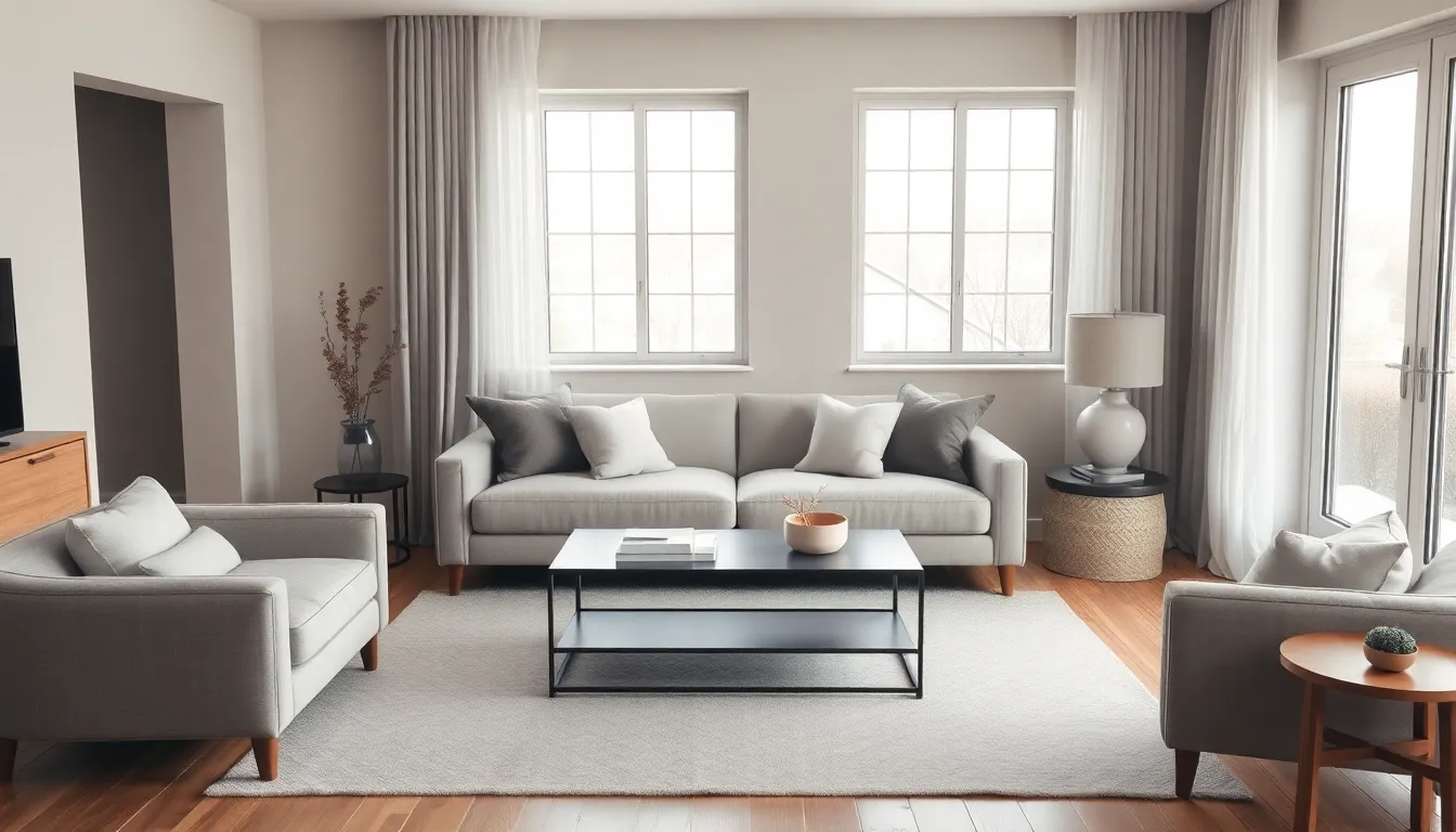
Neutral palettes serve as a foundation in home decor, creating tranquil environments. Designers often use shades like beige, gray, and taupe to establish a serene backdrop. These tones allow furnishings and accent colors to shine. In living rooms, light beige walls paired with dark wood furniture create warmth. In bedrooms, soft gray bedding combined with white accent pieces fosters a restful ambiance. Neutral palettes easily transition between styles, accommodating eclectic or modern elements effortlessly.
Fashion Trends
Neutral palettes dominate fashion trends, providing timeless silhouettes and versatile outfits. Designers incorporate colors such as black, white, and taupe to create chic, understated looks. A monochromatic ensemble in varying shades of gray offers a sophisticated flair suitable for both casual and formal occasions. Accessories in complementary colors enhance neutral outfits without overpowering them. Additionally, layering neutrals allows for textural richness while maintaining a cohesive style, appealing to minimalists and fashion-forward individuals alike.
Graphic and Web Design
Neutral palettes play a significant role in graphic and web design, fostering clarity and focus. Using shades like white and light gray, designers create clean interfaces that improve usability. Neutral backgrounds allow graphic elements, such as images and text, to stand out effectively. For example, a website featuring a white background with dark text ensures readability and visual comfort. Furthermore, subtle variations of neutral colors can provide depth without distraction, creating engaging visual hierarchies that guide users through content seamlessly.
Tips for Using Neutral Palettes Effectively
Implementing neutral palettes in design requires thoughtful techniques. By following specific strategies, designers can maximize the impact of these colors and create inviting spaces.
Balancing with Accent Colors
Utilizing accent colors enhances neutral palettes. Incorporating bold, vibrant hues like navy blue or emerald green creates striking contrasts. Designers should select one or two accent colors to maintain balance, ensuring that neutrals remain the focus. Pairing warm neutrals with earthy tones, such as rust or olive, fosters a cozy atmosphere. Using cool neutrals alongside deep jewel tones, like burgundy or sapphire, conveys elegance and sophistication. Applying accents in decor elements, art pieces, or textiles adds visual interest without overpowering the serene backdrop.
Textures and Patterns
Integrating textures and patterns enriches neutral palettes. Combining various materials, such as wood, metal, and fabric, adds depth and warmth to spaces. Designers should opt for textured surfaces like woven rugs or plush throws to create inviting environments. Patterns, including geometric prints or subtle stripes, can offer visual intrigue while remaining understated. Employing different finishes, such as matte and glossy, enhances the dynamic quality of a neutral palette. By layering textures and patterns, designers achieve a cohesive yet stimulating design that captivates the eye.
Neutral palettes stand as a testament to timeless design and versatility. Their ability to create serene environments while allowing other elements to shine makes them a staple in various fields. Whether in home decor, fashion, or graphic design, these understated tones provide a perfect backdrop that promotes harmony and balance.
The adaptability of neutral shades ensures they remain relevant across ever-changing trends. By skillfully pairing them with bold accent colors and integrating textures, designers can achieve stunning aesthetics that captivate and invite. Embracing neutral palettes not only enhances visual appeal but also fosters a sense of warmth and tranquility in any space.